Besides the dresses, the flowers, and even the shoes, do you know what other thing I like looking at? Wedding stationery! There are so many, many ways to go about designing and decorating your invites. Whether it’s a unique design or something classic, I never get tired of looking at stationery! To tell you the truth, I had such a hard time narrowing down my favorites. (Did you know I originally had 77 options to choose from?) But I’m quite satisfied with my choices. I hope you’ll like them too!
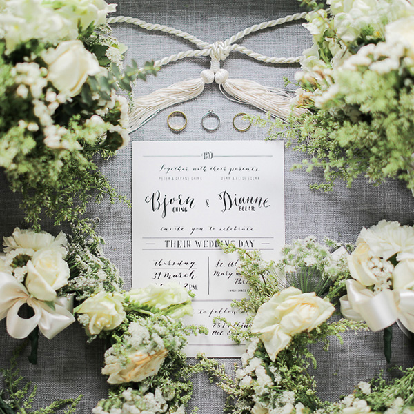
1. Sometimes less is more. This invite doesn’t have patterns or designs, it’s just simple calligraphy and lines. But it’s still so elegant!
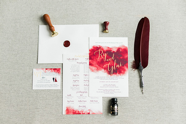
2. Can you guess why this made my list? Yup, that burgundy stain definitely made this one stand out!
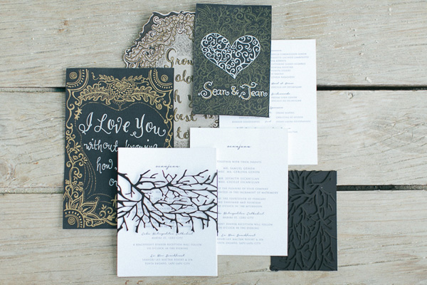
3. If you thought dark colors and patterns are a big no-no for invites, think again!
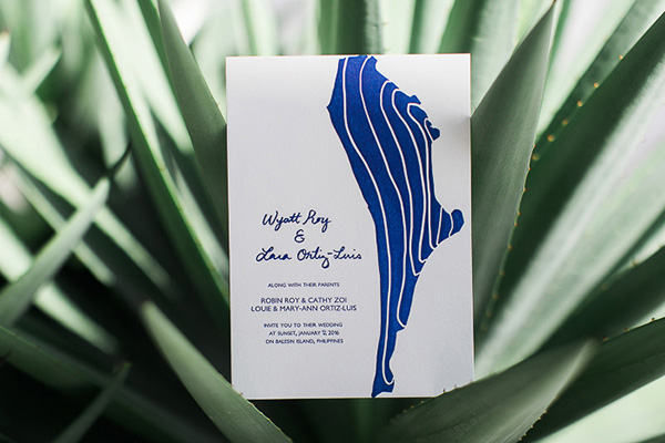
4. I love this simple design! It almost looks like a piece of art too!
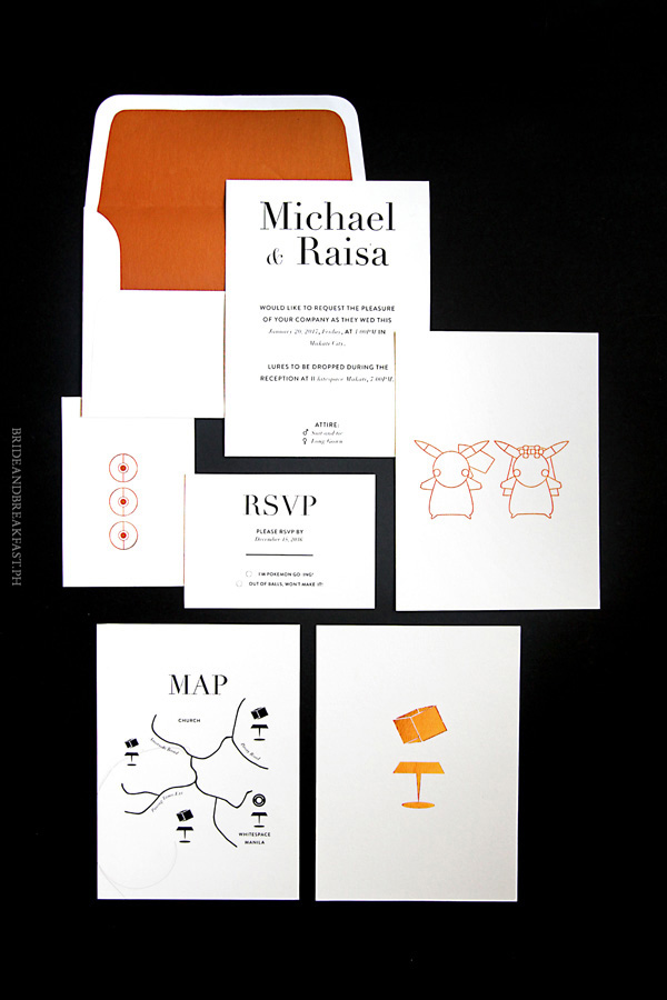
5. Having a themed wedding? Incorporate it in your invites so your guests can take the hint. (Plus, Pokemon–need I say more?)
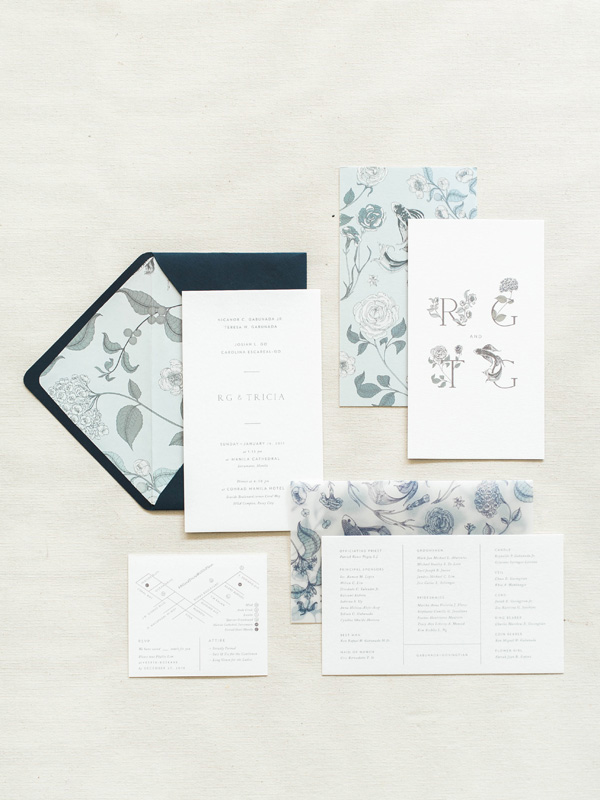
6. From afar, this stationery set might look a bit plain, but take a closer look and you’ll notice the little detailed drawings.
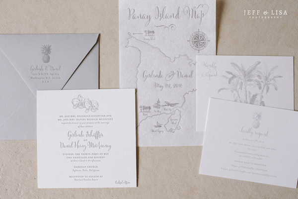
7. The bluish tinge on these invites almost make it look like a watercolor painting. Don’t you think so?
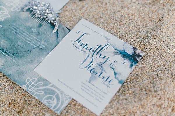
8. I’m loving the gold edges on these invites. And the black and white pattern inside the envelope add such a chic and sophisticated touch!
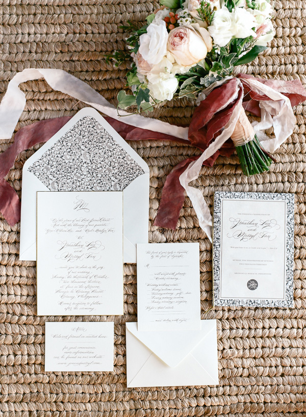
9. Gray and pink is a lovely color combo, don’t you think? And check out the hanging lights design too.
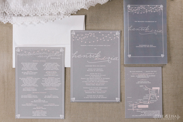
10. Classy looking invite? Check. Work of art? Check.
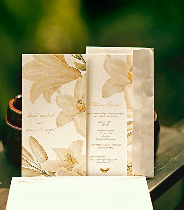
11. If you’ve got several colors in mind for your invites, you can do what this couple did, and use different colored paper.
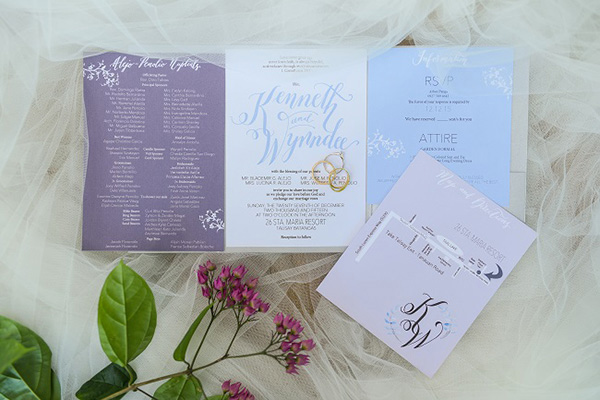
12. I love how clean and minimalist this stationery set is! So if you’re having a minimalist theme, you might want to take inspiration from this one.
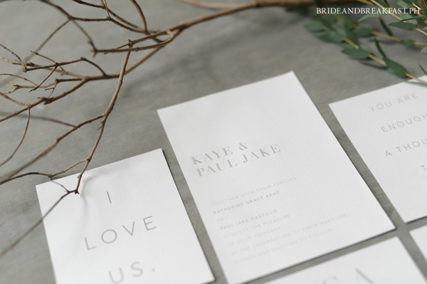
13. Here’s another gorgeous floral invite! I couldn’t leave this one out of my list because it was just too pretty.
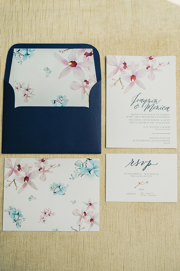
14. The light blue color, the seashell details, and the gold frame, all make for a beautiful invite.

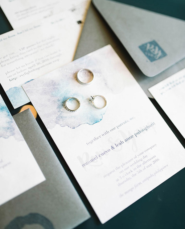
15. The faint calligraphy behind the dark print of the couple’s names is not something I see everyday. And I love the watercolor-like stain at the top too!
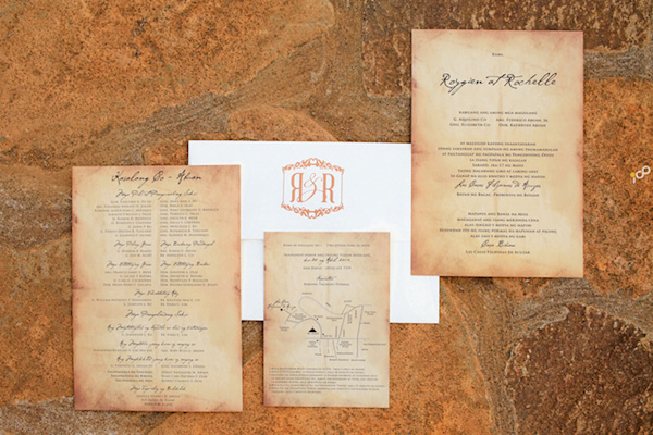
16. Now here’s something else you don’t see everyday! It reminds me of old parchment paper, and I’m totally digging it!
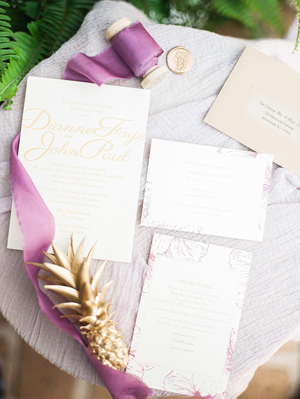
17. This couple had their invites printed with a yellow gold font. It definitely gives off an elegant vibe. And the purple flower designs on the outer edges give it a nice Hawaiian touch too!
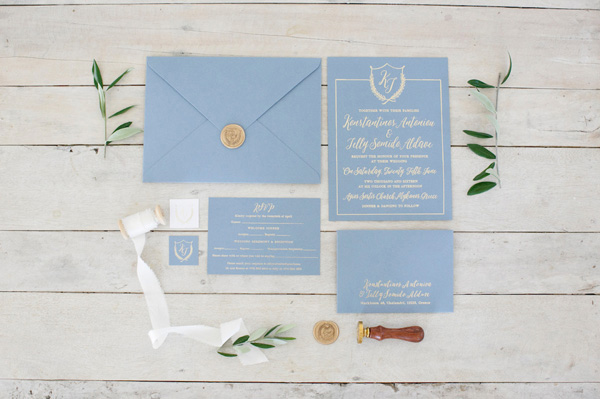
18. Here’s another color combo I have recently come to love! The dust blue paper and the gold lettering are absolutely perfect!
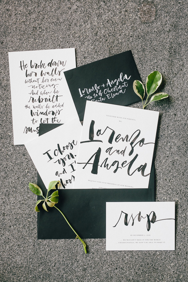
19. This is an example of how bold lettering can make a statement. It’s just black and white, but the calligraphy in these invites steals the show.
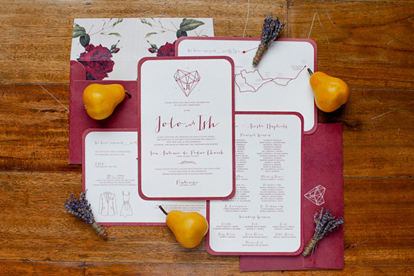
20. The rounded burgundy edges and the geometric accents are some of my favorite parts about this stationery set.
21. The neutral colors and floral designs make this stationery set look oh-so-romantic, don’t you think?
