


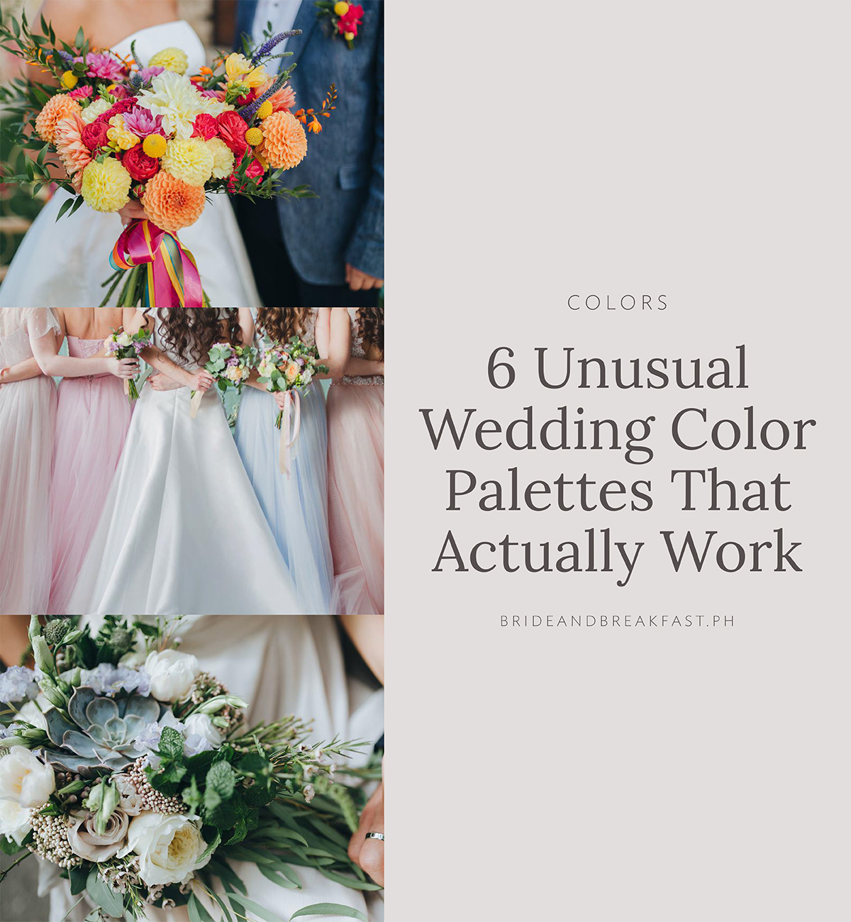
We love a wedding that’s different and out of the box. Whether it’s in the details or in the color scheme, we’re always looking for unusual and unique combos that’ll help make your wedding stand out. Today, we’re focusing on colors! Choosing your color motif has got to be one of the more exciting parts in the wedding planning process, and if you’re looking for something a bit different, then I’ve got a few samples for you to take some inspiration from. Keep on scrolling and comment below your favorite one!
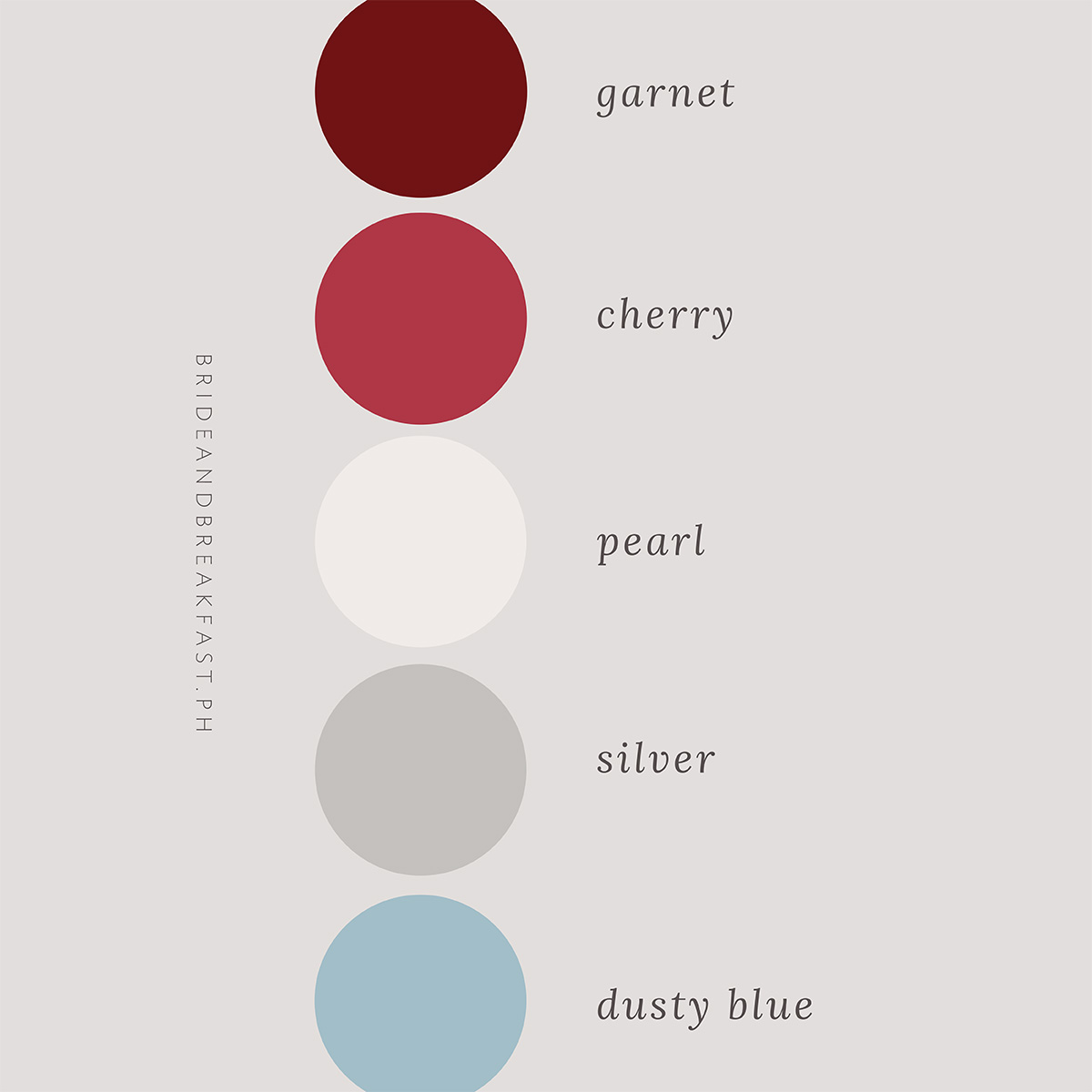
While pink and blue have always been a popular wedding color combo, how about pairing some dusty blue with some cherry and garnet red? The deep, bright red provides the perfect contrast to the light and airy hues of blue. Add in some silver and pearl for some classy accents, and you’ve got a dreamy, almost fairy-like motif.
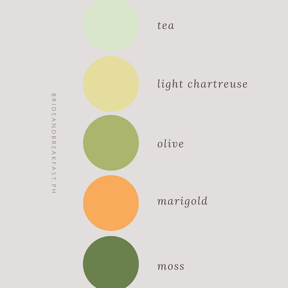
If you want to shy away from dark colors, then consider this combo of shades of green and yellow. The important thing to note when choosing bright colors is to balance out the brightness. If you’re choosing an intense yellow like marigold, then opt for duller greens like tea and olive as accents to make it easier on the eyes.
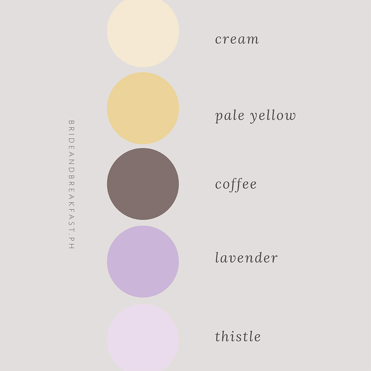
I know what you’re thinking, yellow and purple?? Well, the trick is to choose toned down versions of those colors to make it work. A nice cream or pale yellow really helps bring out the beautiful tones of purple in the lavender and thistle. Remember that your color motif doesn’t necessarily have to be in every aspect of your wedding. Little hints here and there work too!
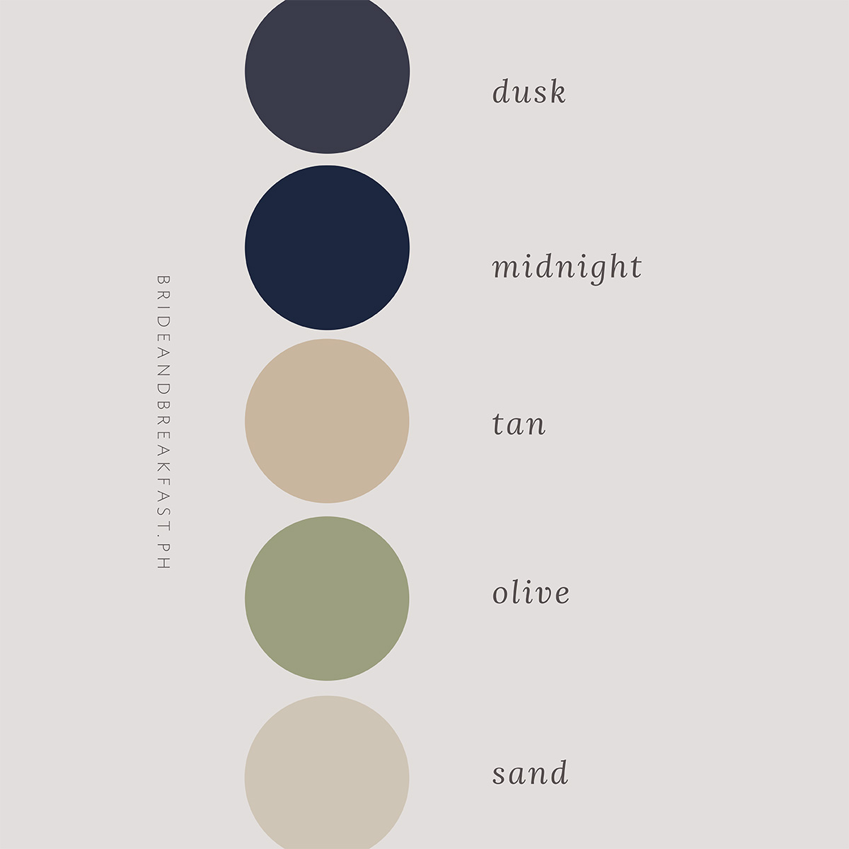
Looking for a more neutral color palette? Then this palette is for you! Here’s a tip: Use the scenery around you as part of your color scheme, and simply add in other elements to bring out the color. Notice how the background of these photos are mostly a tan/sand color? And how other elements were brought in to blend with it? Definitely something to take note of!
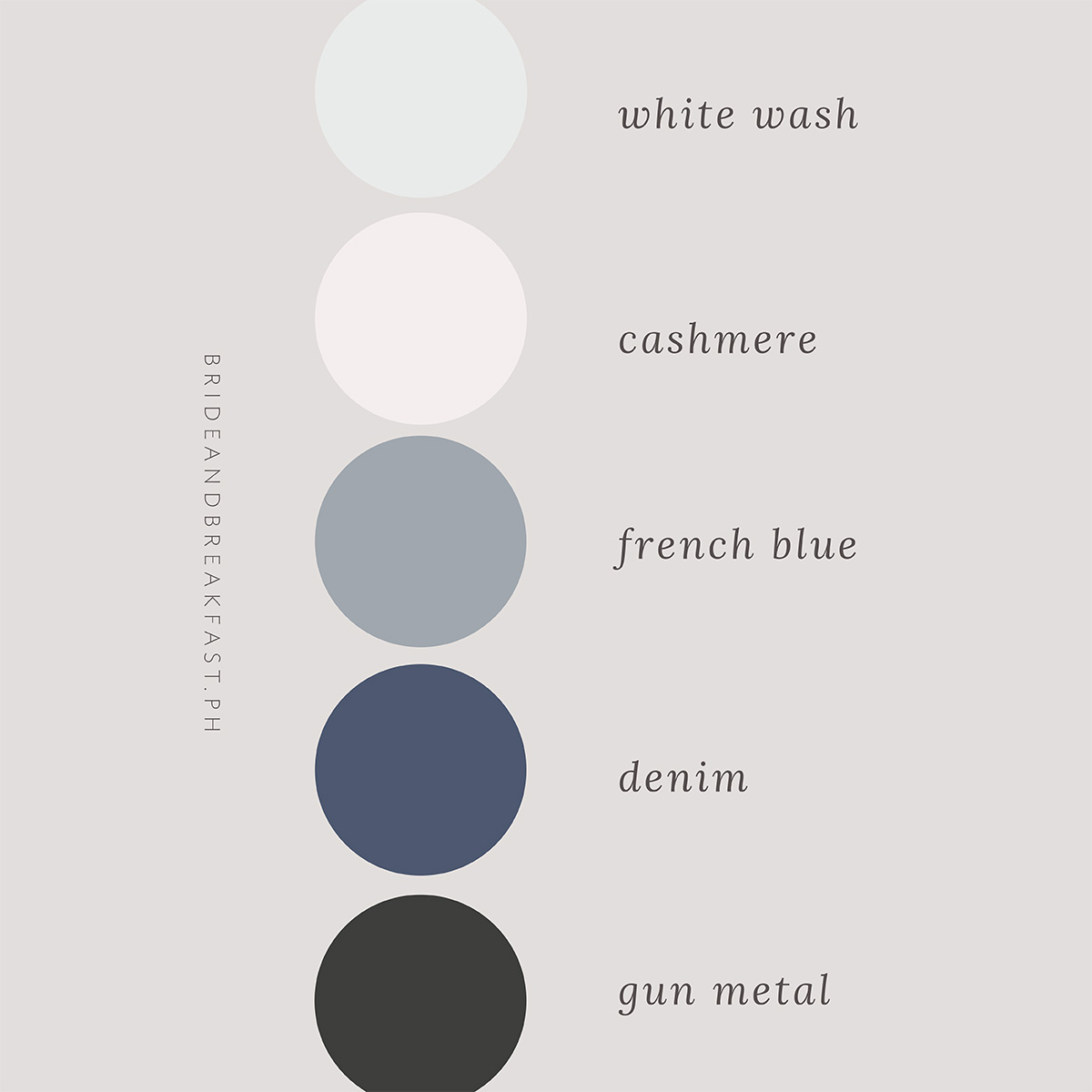
You don’t always have to pick colors that are from completely different ends of the color spectrum. Sometimes picking shades and hues from the same color family works too. (Yes, contrast and accents are everything!) One technique when it comes to picking colors is two choose one color that is lighter and one that is darker. Check out the combo of French blue and denim here!
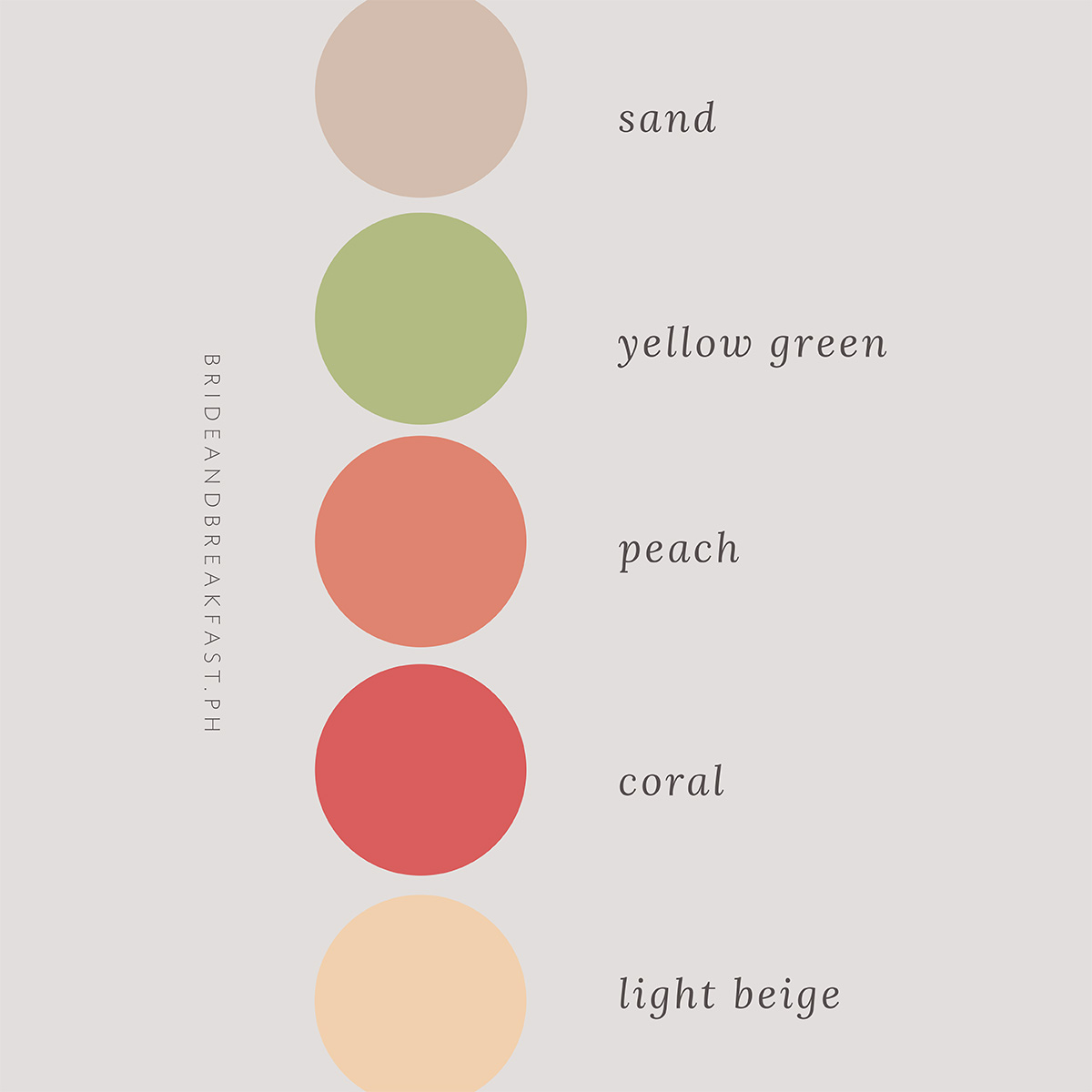
Picking two colors from the same family–like peach and coral–is a pretty good way to ensure consistency. But adding in some green, sand, and light beige will definitely keep it from drowning in one bright color. The yellow green adds pops of color that are a nice contrast to the already bright hues of orange in this color palette.