If you have a job like mine, you tend to really spend hours and hours looking at websites and other resource materials to see the latest trends. As a blogger, I always try to put myself in the bride’s shoes. It’s important to know what couples nowadays want, what they gravitate to, and what catches their eye. In an industry such as weddings, here are some tips I think might elevate how wedding suppliers package themselves. I’ve heard countless conversations how suppliers wished that their couples would be less traditional… well here’s the thing–YOU can be a great influence to them in trying out new things.
- Look Personal but Professional – In this day and age of ubiquitous internet, it makes a whole lot of difference how you do your website. It is the first encounter your couples will have with you. It’s a reflection of who you are and how you perceive weddings. A charming website/logo needs to be well thought out. It needs to be romantic and inviting but at the same time polished and clean. Hire a really good team to do your brand. A team that knows the wedding trends not only here in the Philippines but the rest of the world as well.
- Go Pretty – We have our fair share of men in the industry (photographers and videographers especially) so there really is that tendency to have a logo with more masculine structures, fonts and colors. I am not saying that these logos are bad. However, weddings are all about romance, so it wouldn’t hurt if you brand yourself in this light. Adjectives that you might want to describe they way your logo looks like are romantic, charming, fun and inviting (vs. corporate, strong and sharp).
- Spring or Pastel Tones – Colors that would best appeal to people getting married are seldom big chunks of blacks, browns or grays. Unless you are going for an ultra minimalist look (clean and white), you can try using a mix of upbeat spring tones such as teal, coral, or mustard, nothing overwhelming. Another option is pastel–blush, lavender, peach, or powder blue, most of which you can pair with other neutral tones such as grays and beiges. These shades certainly gets one in the mood to daydream. For male vendors, a tip is to get a lady on board. Having someone with a feminine taste can help you in brainstorming a design for your website or logo! It’s still you but with a waft of charm. Remember, most of your clients are brides-to-be (and grooms that caught the love bug) so its all about the whimsy wedding planning brings.
- Tasteful vs. Tacky – Now since we are working in a creative industry, there is no magic formula or a million-dollar look. Each one of us will have different preferences. Some might go for classic elegance, some might want quirky charm. All of these are perfectly apt for weddings. It’s how you translate these words into images that count. I don’t claim to be the expert in branding, and my opinion is just based on the material I see coming out all over the world. The best way to see the latest trends is to expose yourselves to branding outside the Philippines. Filipinos are very creative! Don’t get stuck with the norm. Be experimental. Sadly, most wedding websites I see can be overly traditional, gloomy and tough looking.
The good news is I’ve really seen a number of wedding suppliers step up their game in branding their product. I commend them for seeing the benefit of having a brand that is competitive both locally and internationally.
A few months back, we at B&B took on the challenge to really be able to express who we are through our brand. In the past two plus years that B&B has existed, I’ve met with a number of website designers, I told them my style and how I envisioned the site to be, although all of them were very talented, I couldn’t seem to find THE ONE who could translate who we were.
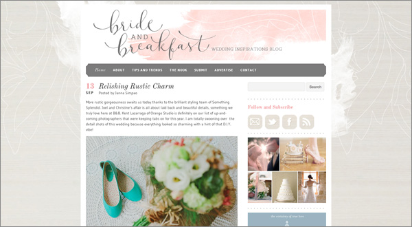
Just this year, I met Fozzy Castro-Dayrit of The Fozzy Book. Fozzy is not really a website designer–in fact her forte is calligraphy and designing invitations. But because I love her style, I begged her to consider designing the new Bride and Breakfast. She excitedly took on the challenge! The first design she sent me hit home. With a couple of improvements here and there, we got it! It was pretty and romantic, subtle and soft. Many of our readers really loved it (and I catch myself staring at it with contentment)! I am smitten with the wood washed background and the watercolor header! The logo, is soooo B&B too don’t you think?
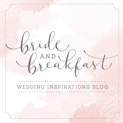
Another person I enlisted in coming up with backdrops for badges and buttons for Bride and Breakfast is Anna Cristobal. Anna, like Fozzy is also experienced in graphics and invitation design. The great thing about her is that I just describe to her in a few words how I want something to look and just let her take lead in coming up with the design. It amazes me how she gets my style instantly–I rarely even have to send her pegs. I loved her work so much that I hired her as the graphic designer of B&B on retainer basis. You will not go wrong with her! Here’s the B&B badge she designed for me.
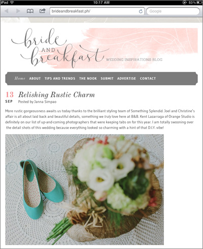
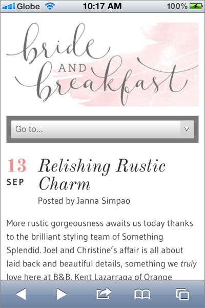
Lastly, because these girls don’t have much experience on the technical side. I got Gian Aguilar, a website programmer and designer to do the backend of the blog, such as coding. Gian is particularly amazing to work with because he really gives input on how to make the site user friendly. Noticed how the new B&B is compatible and scales in size (responsive) whether you are using your laptop, iPad or iPhone? Well that’s all Gian! Polished and professional!
I share all these with you hoping that you too can be inspired to take it to the next level. Create a team that will really allow you to get that dream look of yours that is certainly within reach. As we fancy saying it here in B&B, loveliness is just around the corner!
Special thanks to:


