


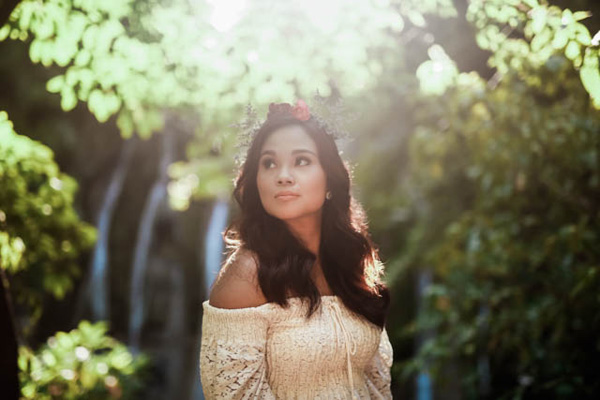
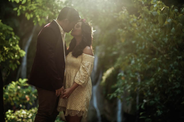
There is always something about twilight that can instantly make everything scenic and more romantic. For Max and Ana’s e-sesh, however, it is not just the after light beauty that sets up the whole mood, but also their undeniable chemistry. Set in the beautiful Daranak Falls and Pililla Wind Farms in Rizal, ProudRad perfectly captured the effortless romance of these two, and I am more than excited to share them with you! Have a look at these heartwarming snaps and prepare to be delighted, darlings!


Continue reading “Dazzling at Dusk”
Photographer: ProudRad / Stylist: Indie Hippie Style / Hair and Make-up Artist: Jan Edrosolan / Venue: Daranak Falls / Venue: Pililla Wind Farms