


We’ve been blogging for a little over three years now. And we’re very, very thankful for the support we’ve received from our readers as well as the people from the wedding industry. Because of the overwhelming response we’ve so gratefully experienced, we decided it’s about time to hold our first ever event. Hence the Bride and Breakfast Garden Soirée.
We wanted to meet and thank the people who’ve worked so hard to help make your wedding beautiful. I’m gonna be talking more about this event in the next few weeks. But because it’s happening tomorrow already, I wanted to give you guys a sneak peek at one of the style elements we worked so hard for in this event–the invitations.
I believe that the invite is the first glimpse a guest will have of an event. It sets the mood for what they can expect and see. And whether it be for weddings, or for an afternoon affair such as ours, I believe that a well-put-together invite makes all the difference.
We were surprised when J Lucas Reyes sent us these photos he took of the invite when he received it. His thoughts about it were beyond heart warming.
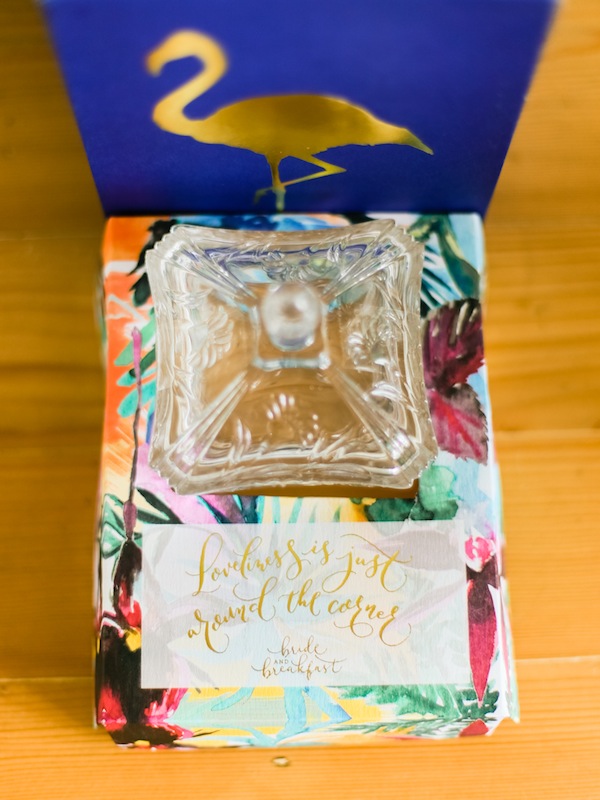
After getting the soft invite of the Garden Soiree, I kinda thought I already had a glimpse of the event. I couldn’t be more dumbfounded after receiving the formal invitation, which just begged the designer in me to muse it over.
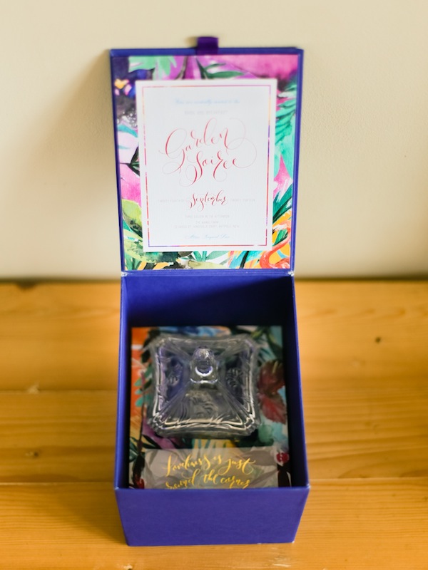
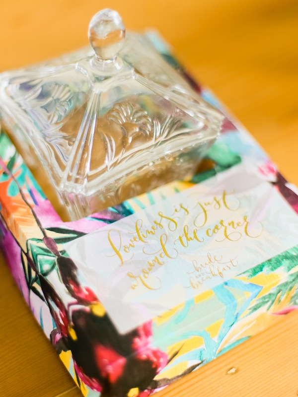
This box is one definitely one for the books. The package was just amazing in all aspects–the unexpected size and format, the love and creativity that went into the design concept and detail, the incredible swirls of color and handmade finish–truly everything in chic unison! And yet the overall presentation is as simple and straightforward as it gets. You just feel all the love in the details.
The invitation was an experience by itself, I can’t wait to see what this is all about.
The theme I wanted to do this year was Tropical Luxe. So I went out and sought the key suppliers who I felt could execute what I had in mind. Let me just rave about these people for a minute!
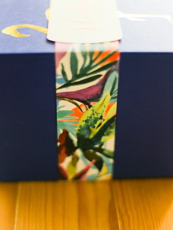
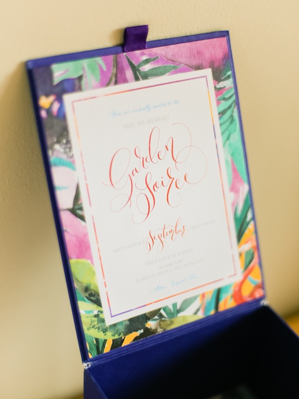
Arlene Sy: Arlene does wonderful hand painting. She was definitely up to the challenge of painting a theme she has never done and colors she rarely uses. The result was just amazing. The invite is hand painted with tropical flowers and a coral flamingo. I’d say it looked pretty chic and fresh–I cannot stop raving about it.
The Fozzy Book: Fozzy is starting to be the go-to name for calligraphy in the wedding industry. I think I will never tire of being in awe of how beautiful she writes. It was pretty cool that we both agreed that the freehand type of calligraphy was the way to go–it was unique and had a certain easy vibe to it. There is just something utterly tasteful when you see your name in calligraphy. And oh, how gorgeous is that red ink we used for the main invite page?
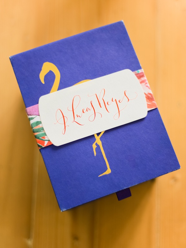
Printsonalities: Being one of the most trusted names in invitation making, we knew we were in perfectly capable hands. Printsonalities was in charge of executing and assembling the invitation. When I first met up with them, I said that I wanted a box invite. I explained how I was planning to put something inside, sort of a pleasant surprise when the box was opened. I wanted a three dimensional invite that would make the recipient’s heart skip a beat when they received it. And boy, oh boy, they definitely delivered. The materials used for the box was of high quality and the workmanship was so clean. One of my favorites was the gold stamping used on the flamingo and some of the calligraphy. It was that detail that added the luxe vibe to the invite.

I am so thankful that we had such a great team collaborate with us on this. I couldn’t wish for a better invitation for the #bnbgardensoiree!